I've gotten feedback recently that my charts/graphics are not as clear as they could be and that they cause certain viewers mental anguish and such.

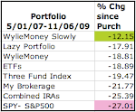
I tried to clean this up a bit- I made the lines thicker and moved the $ to the left. What this chart illustrates most clearly to me is that from May to mid September, the portfolios tracked each other relatively closely. But recently the portfolios have diverged significantly.
The following screenshots are only intended for the curious and for those who might suspect me of manipulating my results. I re-invest all capital gains and dividend distributions. Click the image for a larger view.
WylieMoney 20 Mostly Managed

WylieMoney Slowly


No comments:
Post a Comment